
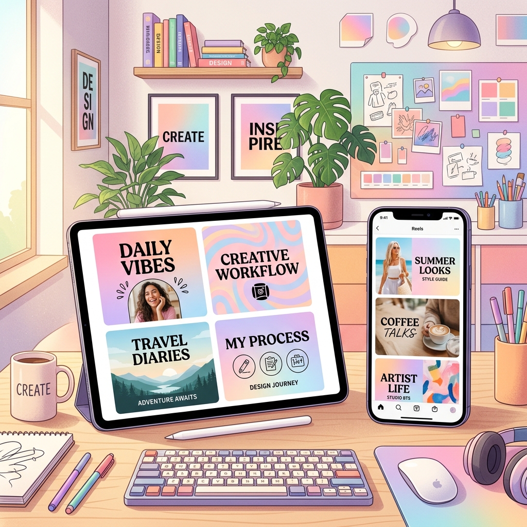
How to Design High-Click Reels Cover Images: Principles & Tools
When users scroll through the Instagram Reels tab or explore your profile grid, they are bombarded with visual options. Before they hear a single word of your audio or see a single frame of your footage, they judge your video by its cover image (thumbnail).
A poorly cropped, blurry, or text-heavy thumbnail can ruin the reach of an otherwise excellent Reel. On the other hand, an eye-catching, structured cover image can double your click-through rate. In this article, we will outline the visual design principles and best tools to create high-converting cover images for your Reels.
1. The Power of Visual Hierarchy
A successful cover image guides the viewer's eye to the most important element first. To achieve this, your thumbnail should have a clear visual hierarchy:
- The Subject (Focal Point): Use a high-quality photo of yourself, a product, or a dramatic frame from the video. Ensure the subject is sharp, well-lit, and stands out from the background.
- The Text Overlay (Hook): Add a concise, bold text title to summarize what the video is about. Use 3 to 5 words maximum.
- Background Contrast: Use dark overlays on light backgrounds or vice versa to make sure your text is easily readable.
2. Respecting the Safe Zones
Instagram displays Reels in different aspect ratios depending on where the user is looking. This is one of the most common design mistakes creators make.
- Reels Feed (Full Screen): Aspect ratio is 9:16 (1080 x 1920 pixels).
- Profile Grid: Aspect ratio is 1:1 square (1080 x 1080 pixels), cropped directly from the center of your 9:16 cover.
How to Stay in the Safe Zone:
To ensure your text overlay and main subject do not get cut off on your profile grid, keep all critical elements centered within the middle square. Avoid placing text at the very top (where header elements reside) or the very bottom (where captions and icons display).
3. Best Typography Practices
Your choice of fonts and styling can make or break readability on small mobile screens.
- Use Sans-Serif Fonts: Bold, clean fonts like Montserrat, Anton, Inter, or Futura are much easier to read than script or decorative fonts.
- Use Background Badges: Put a solid black, white, or brand-colored box behind your text to guarantee 100% legibility regardless of the video frame behind it.
- Limit Colors: Stick to a maximum of two colors for your text (e.g., White and Yellow, or White and Brand Color).
4. Top Design Tools for Creators
You do not need to be a professional designer to create stunning covers. Here are the top tools available in 2026:
- Canva (Web/Mobile): The absolute best tool for beginners. Offers thousands of pre-made Reels cover templates. You can design a cover, crop it, and export it in under 5 minutes.
- Adobe Express: A powerful free alternative to Canva, offering high-quality templates and direct access to Adobe's font library.
- Phonto (Mobile App): If you prefer to edit directly on your phone, Phonto is a simple, free app dedicated entirely to chosing, styling, and layering text over photos.
Cover Design Checklist
Before publishing your next Reel, run through this quick checklist:
- [ ] Is the cover image clear and high-resolution?
- [ ] Is the text overlay readable in under 1 second?
- [ ] Are all text elements within the 1:1 center crop safe zone?
- [ ] Does the design align with your brand colors and aesthetic?
By dedicating just a few minutes to crafting a clean, professional cover image, you ensure your Reels look premium on your feed and attract the maximum number of clicks from explore feeds.